Global Carbon Intensity: How China Wrecked this Metric
Written by:
Shakeb Afsah and
Kendyl Salcito • Sep 18, 2014
Topic: China, Carbon Intensity
Summary
In this research note, CO2 Scorecard shows that a simple metric like global carbon intensity is inappropriate for drawing conclusions about the global de-carbonization trend. Concerned by reports suggesting that global carbon intensity is worsening in the 21st century, we disaggregate data to find that only China is driving the reversal of the long term global de-carbonization trend. We discuss underlying causes, policy implications and methodological recommendations.
Introduction
If there were a magic number to tell us how the world is fighting climate change, it would be world carbon intensity. Carbon intensity, meaning the ratio of carbon we generate compared to the amount of energy we consume, basically tells us how badly we’re polluting. When plotted over time, it sheds light on how the world is weaning itself off of the worst-polluting fossil fuels.
And if carbon intensity is indeed the magic number, we’re all bungling the magic trick. University of Colorado’s Professor Roger Pielke Jr. has recently published new numbers showing that the world’s population managed to decrease its carbon intensity from 1965 until the turn of the 21st century, when suddenly we reversed our progress.
Does this mean that everything we’ve been trying for 15 years has failed? Pielke’s recent blog post confirms the fears he expressed in a 2008 report that cast doubt on the appropriateness of the world’s de-carbonization efforts. Then as now, he states the need for technological solutions and investment in energy innovation.
This generalization about the world, based on the recently released data on energy use and CO2 emissions from BP’s Statistical Review of World Energy for 2014, is bad news. It suggests that the world is making no net gains in carbon intensity, despite the current policies that many countries have adopted to cut CO2 emissions since 2000. These policies, including cap-and-trade, carbon tax, energy efficiency, subsidies for wind/solar/other renewables, and new emissions standards, are the cornerstones of many national climate change policies.
We take a close look at these numbers.
Global Carbon Intensity Charts
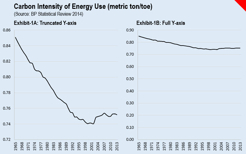
Pielke’s carbon intensity graph, using the data from BP, is shown in Exhibit-1A. The dramatic decline it shows in carbon intensity between 1965 and 1998 was followed by a reversal in 1999, including a visible uptick in carbon intensity in 2003.
We were leery about the truncated Y-axis scale, which limits the range of data displayed on the graphics. The same chart looks far less dramatic when it is drawn against a Y-axis starting from zero (Exhibit-1B). A carbon intensity graph with a full Y-axis makes sense, not just to honestly portray the scale of change, but also because our goal is to reach a carbon intensity of zero. Exhibit-1B makes it clear that we still have a long way to go until that goal is achieved. It also reveals that the uptick of carbon intensity in the 21st century is small enough to merit detailed investigation.
A Closer Look
From here on, the numbers will show CO2 intensity instead of carbon intensity, because the original data from BP and the EIA report CO2 emissions. To convert CO2 to units of carbon (C), simply divide by 3.667. Carbon intensity and CO2 intensity are used interchangeably in the text – both are ratios that depict emissions generated versus energy produced. In the relevant literature, CO2 intensity is also reported as a ratio of CO2 emissions to GDP--which includes the effects of prices. In this note however, CO2 intensity is measured in physical units--metric tons of CO2 per tonne of oil equivalent (toe). Also, 1965 is the first year for the data published by BP.
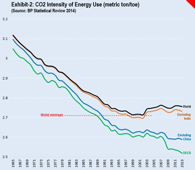
Since the uptick in global carbon intensity is small, it could be an effect of just one or two countries, rather than a global phenomenon. We are particularly interested in the influence of large countries like China, India and the US on the aggregate global carbon intensity. To understand these large-country effects we first plot two scenarios—the aggregate global carbon intensities for the world (1) excluding China and (2) excluding India. We also plot the de-carbonization trend for OECD economies—a group of countries where a variety of CO2 emissions reduction policies are already in place.
In Exhibit-2, global carbon intensity looks quite different without China’s influence—but the same is not true for India. In short, China alone is driving the recent global carbon intensity curve. When a single country can make such a difference to a global-level metric, it raises major questions about that metric’s usefulness.
Deconstruction of Global Carbon Intensity
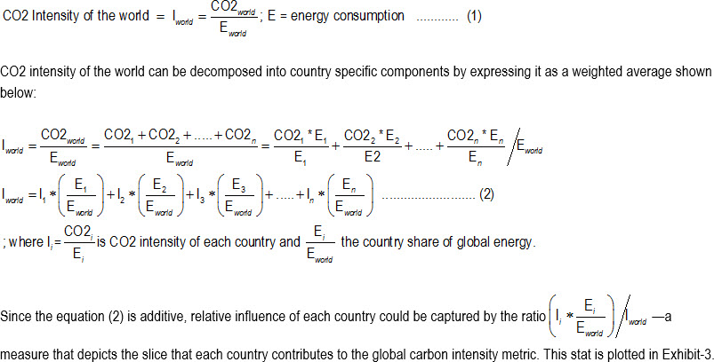
To see how China influences the global trend, we break up the data into individual country-specific contributions. As shown in the appendix, each country influences global carbon intensity via the combined effects of two key factors: country-level CO2 intensity and the quantity of energy consumed. CO2 intensity reflects the clean energy policies and the fuel mix of each country, while overall national energy consumption is influenced by a variety of factors. Energy efficiency, the size of an economy and energy prices are obvious factors but national macro- and industrial policies play a role, too.
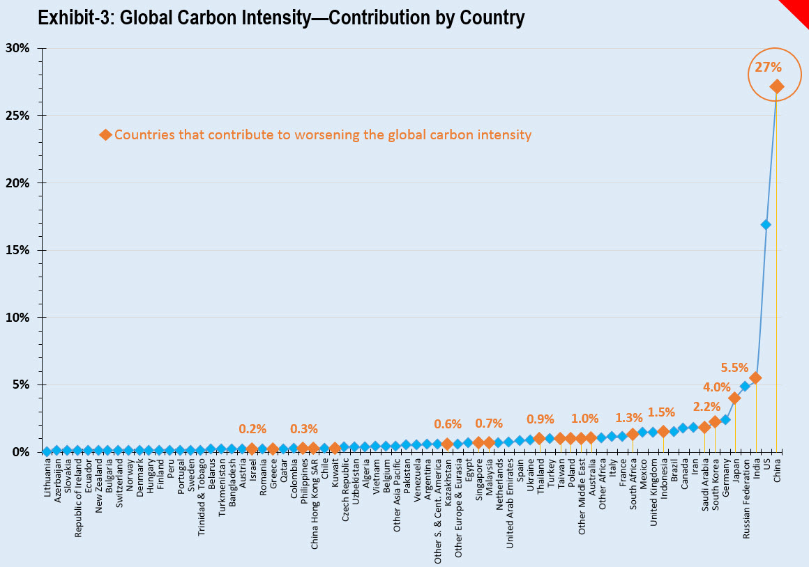
When we disaggregate each country’s contribution to global carbon intensity, certain countries stand out as major contributors of global CO2 per unit of energy used—this is plotted in Exhibit-3. China is playing the biggest role in boosting the carbon intensity at the global level, followed by the US and India.
Countries like China and India that are worsening the global intensity are marked as orange in Exhibit-3—their carbon intensity is higher than the global average and their global share of energy consumption is increasing over time. In comparison, the US and many countries in Europe are marked blue, because they contribute to lowering the global intensity—their carbon intensity as well as their share of energy consumption in the global economy are declining.
China is the leading driver of global carbon intensity. While India has comparable CO2 intensity (3.25 t/toe to China’s 3.34) and a GDP two and half times smaller, China’s contribution to global carbon intensity is five times bigger than India’s. The disproportionality here points to something unique about China.
What’s up with China?
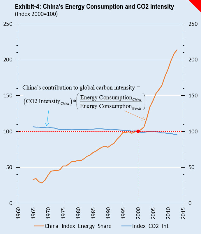
To understand the oversized influence of China on global carbon intensity, we need to know both how China can make such a big dent in global CO2 intensity efforts, and why. The answer to both of these questions can be found in China’s energy use trends. Exhibit-4 makes it clear that it is not the fuel mix but the rising scale of energy consumption in the Chinese economy that has the biggest impact on global carbon intensity.
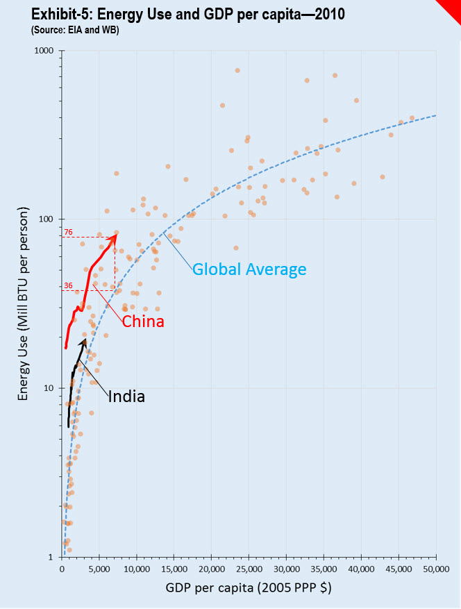
We first examine how. This requires us to check if China’s energy consumption is abnormally high compared to the norm. Exhibit-5 shows the global pattern for energy consumption and GDP on a per capita basis. When a country deviates a lot from the global norm curve, this signals that country-specific factors are at play. It is not much of a big deal if a small country (like Trinidad and Tobago) deviates from the global average curve; but for large economies like China and India per capita deviation from the global average can translate into significantly large energy use and excess impact on global carbon intensity.
According to US-EIA data in 2010, China consumed 76 million BTU per person, while an economy at its GDP per capita is expected, on a rough average basis, to use 36 million BTU per person – China more than doubles the expected average. Given China’s size, the more energy used per person, the more emissions generated, and the bigger share of the CO2 intensity pie gets allocated to China. In comparison, India consumes 19 million BTU per person – still above the global average curve, but only by 5 million BTU. If China were to bridge even half of this potential discrepancy from the global pattern, it would eliminate the upward tick highlighted in Exhibit-1A. But the story doesn’t end here.
We next examine why. This gets us into the structure of the Chinese economy. As shown in Exhibit-6, industrial value added in China accounts for nearly 50% of the total GDP—a share far higher than the norm for the rest of world or the region. Much of the divergence from global and regional benchmarks comes from China’s heavy industries. The more reliant an economy is on energy-intensive industries, the more linked its CO2 emissions are to macro- and industrial policy measures.
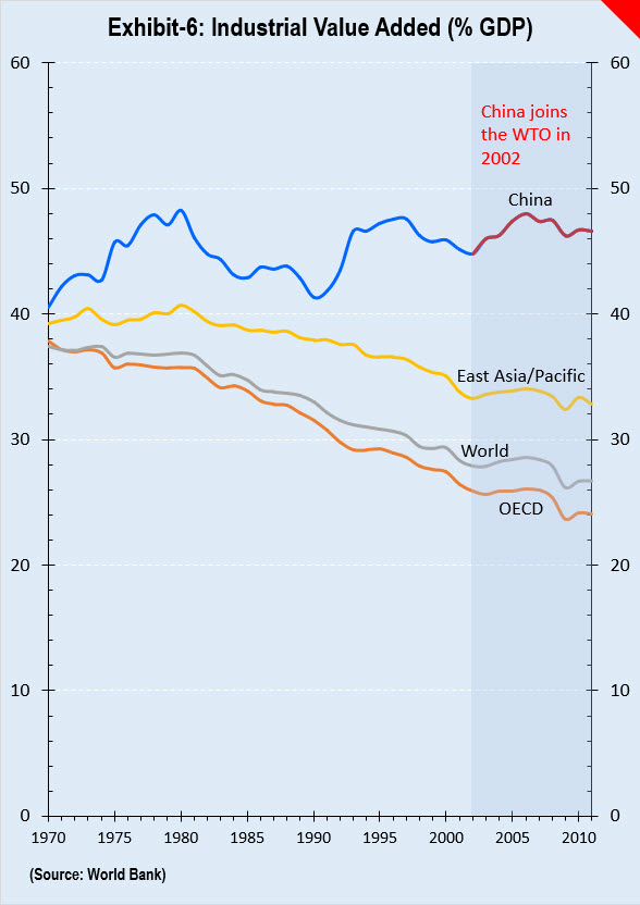
World Bank economists (Hofman & Kuijs 2008) trace the country’s carbon track record back to the 1990s, when China adopted economic policies to boost its industrial base. Between 1990 and 2006, China increased its industrial value added, on average, at the rate of 12.6%, creating an economy where industry generates nearly half its GDP. (Note that “per capita” is a bit of a misnomer – individuals within China’s economy could not possibly consume the amount of energy the country burns. Instead, it’s heavy industry.)
The lopsided focus on industries, according to the World Bank economists, created a demand for energy 4 to 6 times the standard for advanced economies (the notion depicted in Exhibits 5 & 6). To support its industries, China has also kept its exchange rate down and subsidizes coal and electricity[1], which, in turn, has made it the world’s largest exporter of manufactured goods. China’s policies have lowered the price of its energy-intensive products, thereby boosting their demand in OECD and other countries—making it hard to evaluate if it is the consumer demand in international markets or the subsidized supply from China that is driving the cross-border trade in energy-intensive products. China now exports products that other economies are increasingly deeming too energy-intensive to produce.[2]
This begs an interesting question: is Pielke right to use the broad brush of average CO2 intensity, in a world where countries can outsource their emissions to low-income, industrializing neighbors? If the west is decarbonizing at the expense of the rest, are such averages informative, even if they overshadow the nuances between countries?
Not quite. The high share of energy consumption in China is not just about its fossil fuel intensive energy system but also its historical macro-economic approach that for more than three decades has prioritized industrialization. It’s also about the way China pursued an industrial economy. China has actually propped up its polluting industries, providing a financial disincentive for emissions reduction. Current policies continue to subsidize energy intensive sectors like steel; such supply-side eco-unfriendly approach remains a source of trade dispute even today.
Even in the domestic sector, its national policies have created a construction boom that has caused a huge surge in cement production—another energy intensive industry. Growing at more than 10% annually, China doubled its cement production between 2005 and 2012. In essence, China’s national strategy to promote construction projects and industrialization has also locked the economy into a highly energy intensive structure. Possibly as a result of this, the ongoing US-China partnership for climate management has selected steel and cement as the priority sectors.
The circumstances resulting from China’s emissions policies make China uniquely interesting. While the west focused on energy efficiency measures and policy commitments, China focused on industrialization at any environmental cost. Pielke took global aggregate carbon intensity to cast doubt on the relevance of emissions policies in his blog, but it’s actually China’s national macro- and industrial policies (unrelated to their clean energy policies) that make a big difference.
The Bottom-Line
In his blog Pielke did not mention China. That China alone influenced the trend makes Pielke’s generalization misleading. Carbon intensity is meant to reflect the effectiveness of clean energy policies—but this metric is not appropriate at the global level when a single large country’s national macro and industrial policies leads to excessive energy use.
That said, allocating accountability for carbon pollution across countries is highly contentious. Recently, policy makers from India and China leveraged their veto power at the IPCC to conceal the reality of the current and future CO2 emissions from developing countries. Our numbers show that China and India contribute the most to worsening the global carbon intensity—yet its top leaders are notably absent from the UN’s Climate Summit this month in New York. This kind of posturing asserts the national political perspective that the problem predates newly growing economies, but it is potentially catastrophic from a global perspective. Policy actions to cut CO2 emissions must be country-specific while benefitting from collective effort. The data should not be seen to allocate blame, but to pinpoint the places where policy shifts will have the most bang for their buck.
China has announced a variety of initiatives aimed at softening its carbon footprint, including converting coal plants to natural gas, expanding its nuclear power industry, boosting its renewables capacity and initiating an emissions trading program. But China needs to radically trim down its total primary energy consumption. Energy efficiency programs are essential but fixing its macro-policies to create a more balanced economy is a pre-condition for long-term success. Efforts at rebalancing the economy—that is, shifting resources away from heavy industries towards services—could be working. A recent analysis (Myllyvirta 2014 & Guay 2014) pointed to some early signs of such improvements in the Chinese economy. In a political context like China’s where change can be implemented from the top down, it stands a real chance of achieving these aims.
However, economic reports from the International Monetary Fund (IMF 2014) and Chinese scholars (Dollar 2014) indicate that the rebalance is proceeding slowly. Some of the ongoing restructuring could simply be a result of diminishing returns to capital in an over-capacity industrial economy. Until China’s economic restructuring is well on its way, we are not likely to see a real peak in coal use or a stabilization of CO2 emissions.
Rather than scold the globe for an indicator that fails to recognize that single behemoth economies can manipulate global averages, we should keep metrics like global carbon intensity out of any meaningful climate policy analysis. As Jeff Goodell of Rolling Stone puts it, the fate of the planet is in China’s hands. Let’s not apply a reductionist metric to generalize and distract us from country-specific focus we urgently need to tackle the challenge of climate management.
Appendix-1: Decomposition of Global Carbon Intensity
This is a weighted average formulation of global carbon intensity, where the weight is the energy consumption of each country as a share of the global total. It shows that the quantity of primary energy consumed in an economy heavily influences the global carbon intensity.
[1] http://www.wri.org/sites/default/files/uploads/fossil_fuel_subsidies.png
[2] http://www.theguardian.com/environment/2014/jan/19/co2-emissions-outsourced-rich-nations-rising-economies